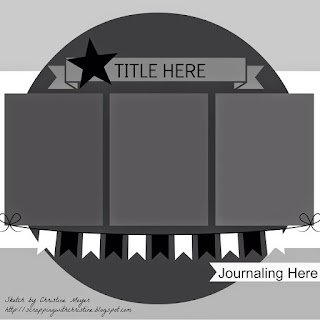
Hello my dear friends and happy Monday. I'm back with a few layout shares. The first one was based off of the following sketch from My Creative Sketches blog.
I love the center design but I didn't have just three vertical photos so I squeezed in my 6 3x4 photos instead. I love the circular background element too and I had this die cut created with the Silhouette Cameo and placed that to draw the attention towards the center. I also love how the white color of the design is a great way to break the dark colors of this page (photo and red background paper)
Here are some more close ups....
Thank you so much for stopping by.
Till next time,
Grace


1 comment:
very pretty! great job!
Alicia
Post a Comment